Magazine practical task evaluation
Publication to blog and analysis
Create a blogpost called 'Magazine practical task evaluation' and complete the following tasks:
1) Save your finished Photoshop magazine cover as a JPEG image and upload it to your evaluation blogpost.
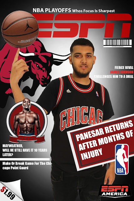
2) Write an evaluation of your work: have you succeeded in your brief to create a new, original edition of an existing magazine?
Yes, i believe i succeeded at creating an ESPN sports cover. Within 2 of the ESPN covers i got my inspiration from, i focused on making the back-ground fade from one colour to another and the basketball balancing on the actors hand. The rest of the magazines that i came across had features from other aspects of the sporting industry, a main headline and logos. Due to my poster being having an American theme, i had to make sure that the cover had a dollar sign instead of a pound sign to make it look more follow the theme of the magazine.
3) Put your cover alongside a couple of genuine covers of your chosen magazine. How professional is your work alongside genuine examples?
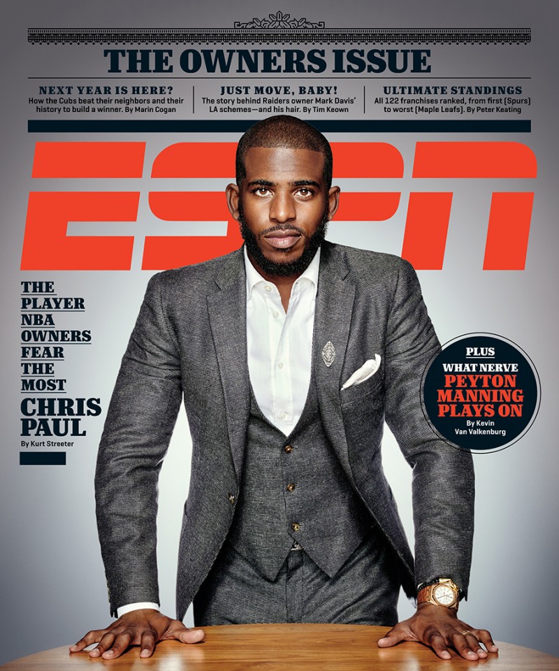


I think my magazine cover looks pretty good in comparison to the ESPN covers along side it. However, if i made it made the test allocated to the coulombs, it would have looked a lot more structured.
4) What is the strongest aspect of your work?
5) What is the weakest aspect of your Photoshop magazine cover?
6) What would you do differently if you completed this assignment again?
Create a blogpost called 'Magazine practical task evaluation' and complete the following tasks:
1) Save your finished Photoshop magazine cover as a JPEG image and upload it to your evaluation blogpost.

2) Write an evaluation of your work: have you succeeded in your brief to create a new, original edition of an existing magazine?
Yes, i believe i succeeded at creating an ESPN sports cover. Within 2 of the ESPN covers i got my inspiration from, i focused on making the back-ground fade from one colour to another and the basketball balancing on the actors hand. The rest of the magazines that i came across had features from other aspects of the sporting industry, a main headline and logos. Due to my poster being having an American theme, i had to make sure that the cover had a dollar sign instead of a pound sign to make it look more follow the theme of the magazine.
3) Put your cover alongside a couple of genuine covers of your chosen magazine. How professional is your work alongside genuine examples?


I think my magazine cover looks pretty good in comparison to the ESPN covers along side it. However, if i made it made the test allocated to the coulombs, it would have looked a lot more structured.
4) What is the strongest aspect of your work?
- colour grading
- consistent theme
- the ball looks like its actually balancing on his finger
- has a logo
- has a bar-code
- has a price tag
- has a feature
- has sporting logos
- has a headline
5) What is the weakest aspect of your Photoshop magazine cover?
- doesn't follow the coulomb rule
- has a lot of blank space
6) What would you do differently if you completed this assignment again?
- stripping the background away from aranjit
Comments
Post a Comment